| View previous topic :: View next topic |
| Author |
Message |
Senor
Admiral


Joined: 12 Nov 2003
Posts: 1114
Location: estonia
|
 Posted: Wed Aug 03, 2011 8:52 am Post subject: New research pictures Posted: Wed Aug 03, 2011 8:52 am Post subject: New research pictures |
|
|
I'm redesigning all research icons so they would be in one coherent style. I thought a minimalist pictogram style could be funny. What do you guys think?
This is a picture i made for leadership.
 |
|
| Back to top » |
|
 |
admin
Board Admin


Joined: 09 Jan 2002
Posts: 2938
|
| Posted: Wed Aug 03, 2011 9:30 am Post subject: |
|
|
looks nice,
it could though maybe be a bit more scientific |
|
| Back to top » |
|
|
Senor
Admiral
Joined: 12 Nov 2003
Posts: 1114
Location: estonia
|
| Posted: Wed Aug 03, 2011 10:59 am Post subject: |
|
|
| hmm. i think you're right. i'll post some more style versions later. |
|
| Back to top » |
|
|
Anachronism
Lieutenant Commander


Joined: 15 Mar 2011
Posts: 67
|
| Posted: Wed Aug 03, 2011 11:44 am Post subject: |
|
|
| I like it! It's much more memorable and also funny. And in a way it is more scientific than a picture with a sci-fi-elements when you think about it. |
|
| Back to top » |
|
|
spacetrace
Board Admin

Joined: 24 Dec 2001
Posts: 1624
|
| Posted: Wed Aug 03, 2011 3:02 pm Post subject: |
|
|
generally a good idea to make it like pictograms.
so the player would have a clear idea of a basic research and that it is not something "countable".
but why are they burning? 
p.s. sorry man... your the best art director ever  |
|
| Back to top » |
|
|
Senor
Admiral
Joined: 12 Nov 2003
Posts: 1114
Location: estonia
|
| Posted: Wed Aug 03, 2011 5:13 pm Post subject: |
|
|
thats what leadership is all about (sending people into fiery deaths) no?
 |
|
| Back to top » |
|
|
Senor
Admiral
Joined: 12 Nov 2003
Posts: 1114
Location: estonia
|
| Posted: Wed Aug 03, 2011 6:57 pm Post subject: |
|
|
ok. i still like this style very much. I made it a bit more technical, like its taken from a manual or something.
It's like, you're the stupid planet commander and these pictures are made by scientists to make you understand the basic concepts of their work.
every picture could be a kind of "instructional pictogram" that has a funny gag in it. something like carricatures. I think this could work well and is pretty original.
the cloning clabs
 |
|
| Back to top » |
|
|
spacetrace
Board Admin
Joined: 24 Dec 2001
Posts: 1624
|
| Posted: Wed Aug 03, 2011 7:22 pm Post subject: |
|
|
| clonelabs... it's cool |
|
| Back to top » |
|
|
admin
Board Admin
Joined: 09 Jan 2002
Posts: 2938
|
| Posted: Thu Aug 04, 2011 3:26 pm Post subject: |
|
|
| i like it |
|
| Back to top » |
|
|
vyor
1st Rear Admiral

Joined: 11 Feb 2011
Posts: 218
|
| Posted: Thu Aug 04, 2011 3:34 pm Post subject: |
|
|
| like from portal 2... they are great |
|
| Back to top » |
|
|
Senor
Admiral
Joined: 12 Nov 2003
Posts: 1114
Location: estonia
|
| Posted: Thu Aug 04, 2011 8:33 pm Post subject: |
|
|
i redid the leadership.
i guess it would be a nice idea to use spaceships and spacey stuff in most of these pictures. also i removed the blue frame, i think it works better this way.
basically its a "how to" about following your leader everywhere.

what you say? your feedback is very important. |
|
| Back to top » |
|
|
spacetrace
Board Admin
Joined: 24 Dec 2001
Posts: 1624
|
| Posted: Thu Aug 04, 2011 8:52 pm Post subject: |
|
|
| yeah... mindblasting |
|
| Back to top » |
|
|
admin
Board Admin
Joined: 09 Jan 2002
Posts: 2938
|
| Posted: Thu Aug 04, 2011 9:08 pm Post subject: |
|
|
what about having them a bit more scientific like this
 |
|
| Back to top » |
|
|
Senor
Admiral
Joined: 12 Nov 2003
Posts: 1114
Location: estonia
|
| Posted: Thu Aug 04, 2011 9:08 pm Post subject: |
|
|
clone labs picture had a small makeover
 |
|
| Back to top » |
|
|
Senor
Admiral
Joined: 12 Nov 2003
Posts: 1114
Location: estonia
|
| Posted: Thu Aug 04, 2011 9:16 pm Post subject: |
|
|
| admin wrote: | what about having them a bit more scientific like this
|
i like both styles and i can go either way.
i'll make one research in the scientific style, then we can choose. |
|
| Back to top » |
|
|
spacetrace
Board Admin
Joined: 24 Dec 2001
Posts: 1624
|
| Posted: Thu Aug 04, 2011 9:31 pm Post subject: |
|
|
| it is possible that that style could be better fitting... in the end is ST a very technical game |
|
| Back to top » |
|
|
Senor
Admiral
Joined: 12 Nov 2003
Posts: 1114
Location: estonia
|
| Posted: Thu Aug 04, 2011 11:29 pm Post subject: |
|
|
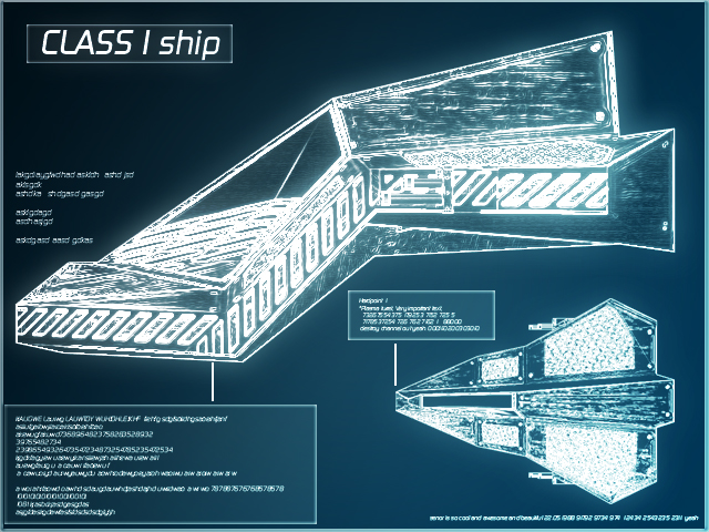
i think you guys are right. this style is better suiting.
this is the genesis project in a technological style.
 |
|
| Back to top » |
|
|
spacetrace
Board Admin
Joined: 24 Dec 2001
Posts: 1624
|
| Posted: Fri Aug 05, 2011 12:10 am Post subject: |
|
|
| oh yeah ... it's great ... i think a favor it... what can i do .. i am a scientist |
|
| Back to top » |
|
|
Anachronism
Lieutenant Commander
Joined: 15 Mar 2011
Posts: 67
|
| Posted: Fri Aug 05, 2011 2:36 am Post subject: |
|
|
Oooh, please rethink it! I know I shouldn't be nagging about your decision with you being admins and all ...
But the "scientific" style, as great as it looks, is rather monotonous (I know it's meant to be!), or let's say ... conventional.. It doesn't really invite you to look at the details and certainly it doesn't make you smile. I don't say, its bad ... it's cool and obviously the work of a pro, but it won't get the attention it deserves relating to the work in it.
If I have a vote, I'd vote strongly for the pictograms, because they are awesome. And fun.
Sorry! |
|
| Back to top » |
|
|
admin
Board Admin
Joined: 09 Jan 2002
Posts: 2938
|
| Posted: Fri Aug 05, 2011 6:32 am Post subject: |
|
|
i like both styles.
maybe we can use the big scientific picture for the manual and the small pictograms in game, when you start a research
i was thinking to place these pics in game more, as mouseoverlays, when you hover over a research in the research screen
so we would need a small pictogram in maybe 240x180 px and a large picture like the last one for the manual |
|
| Back to top » |
|
|
|